Minimalist Campaigns
- Katelin Kinney
- Nov 26, 2020
- 2 min read
Updated: Jan 17
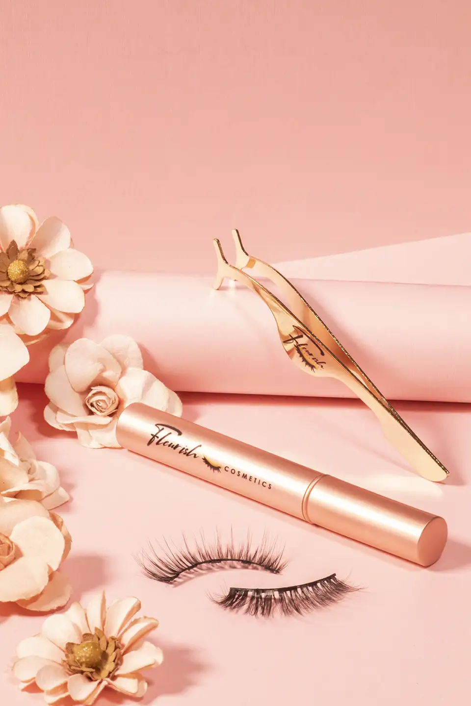
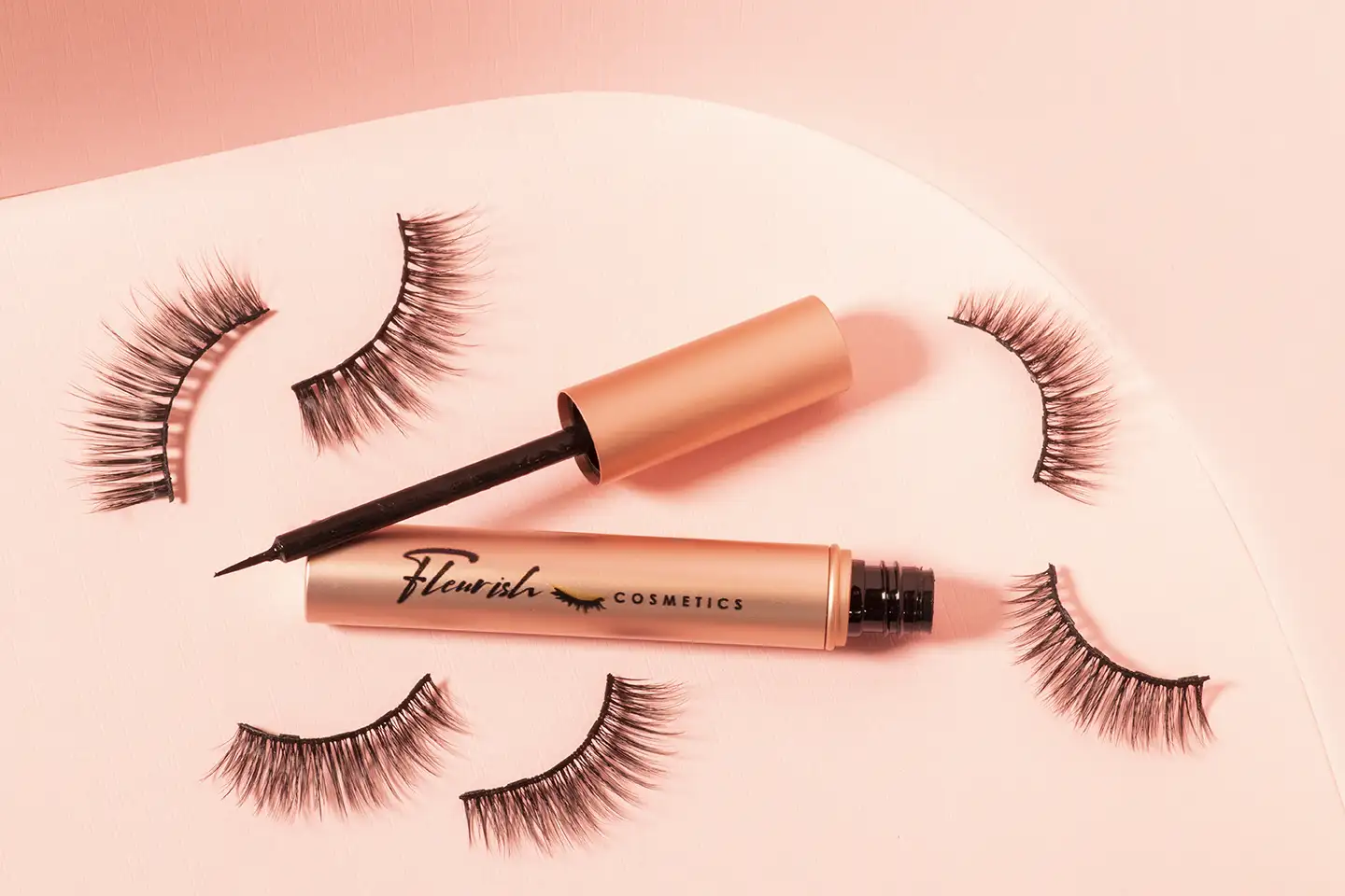
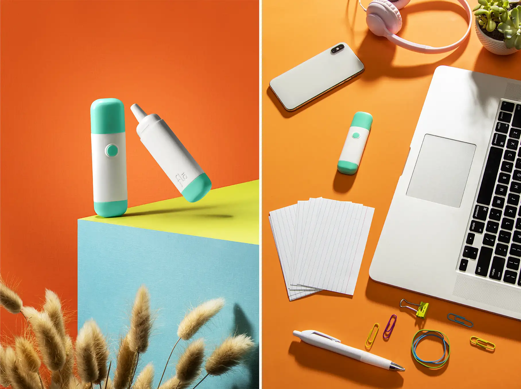
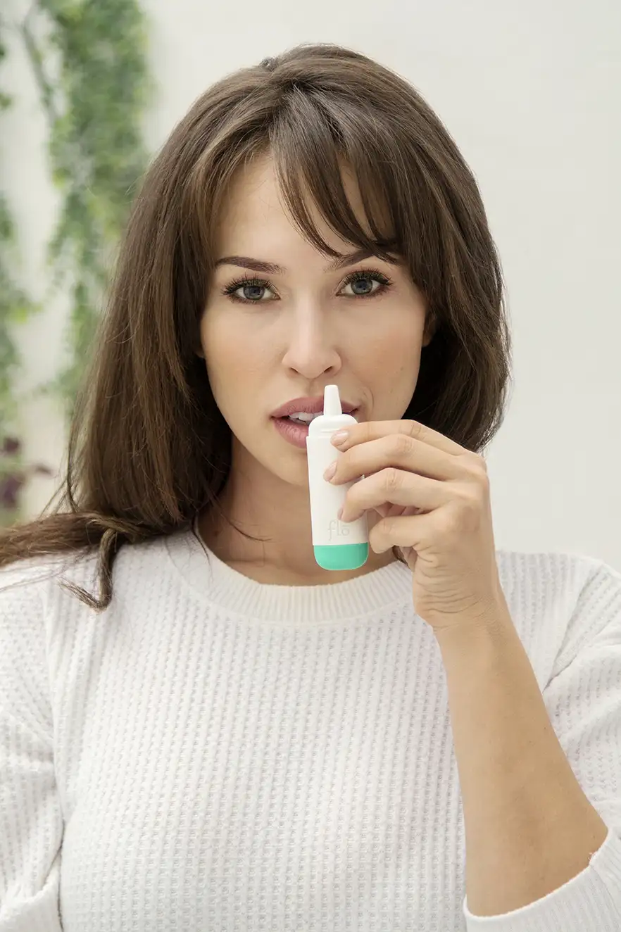
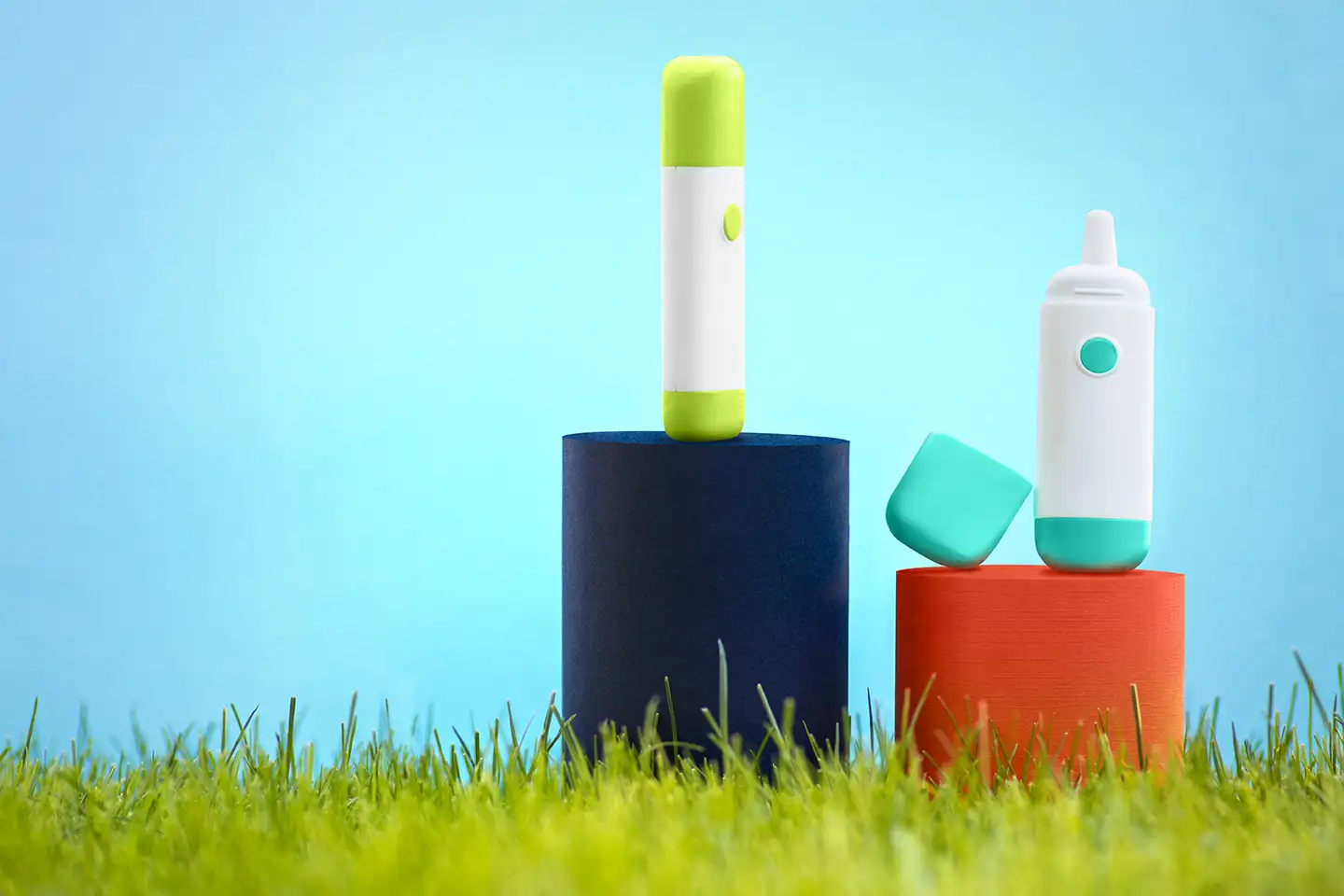
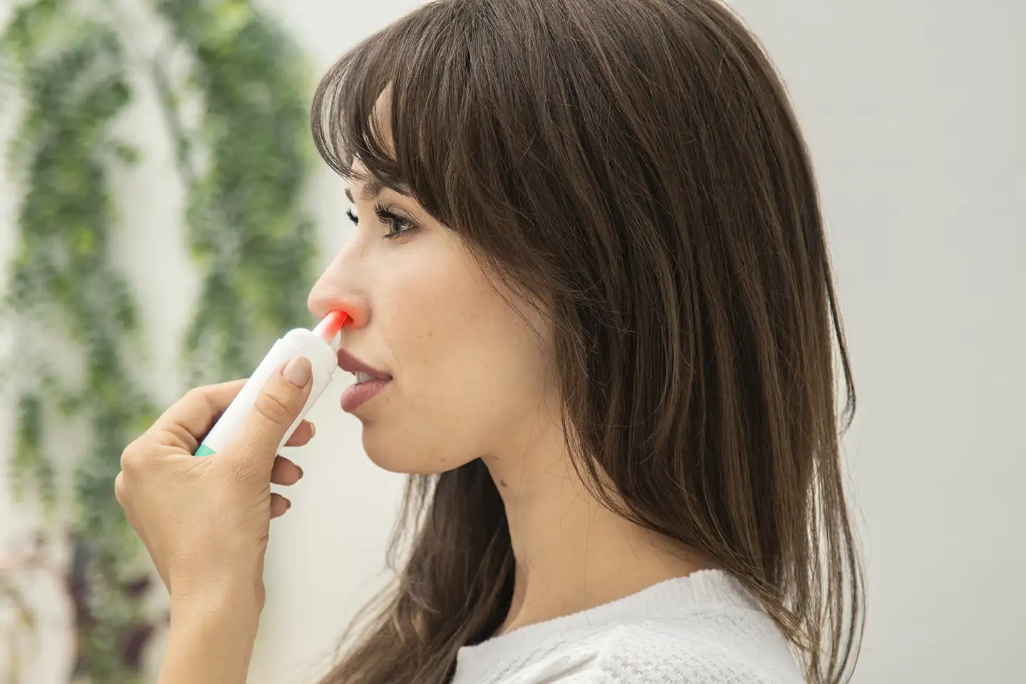
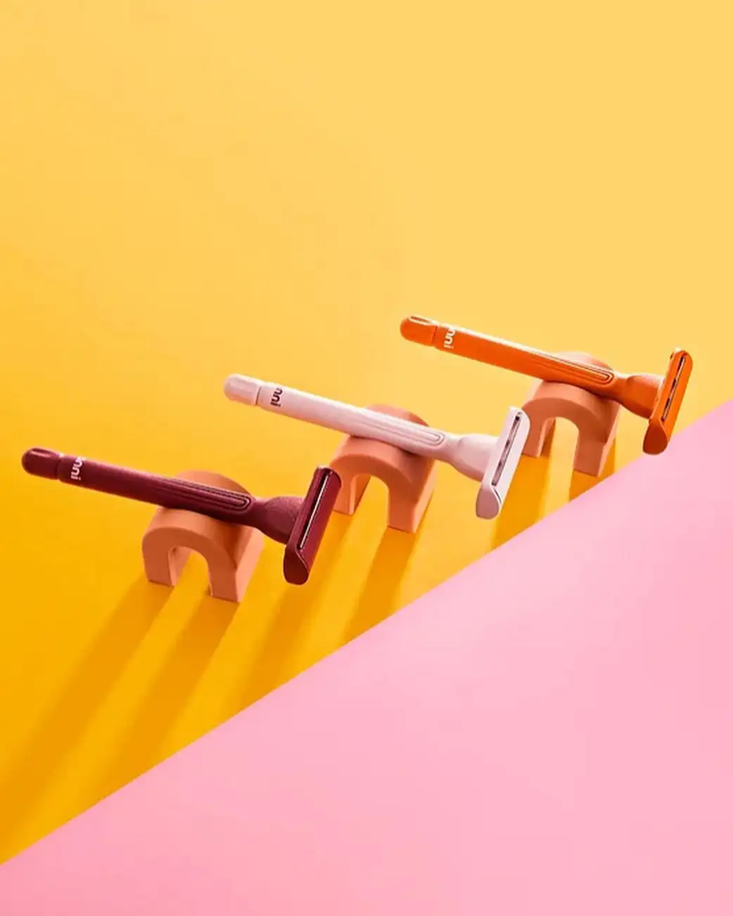
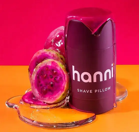
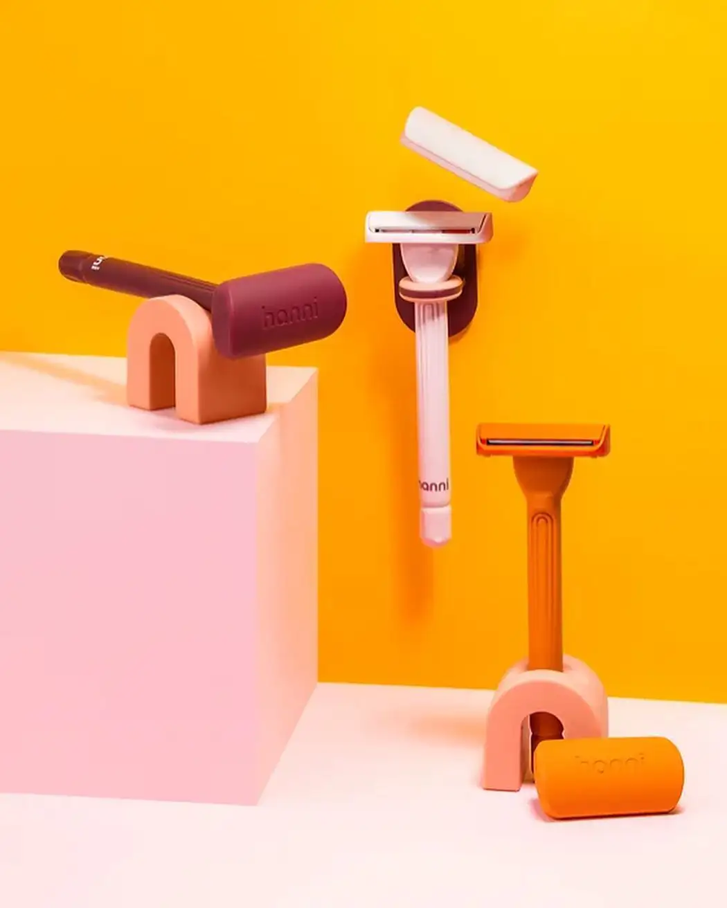
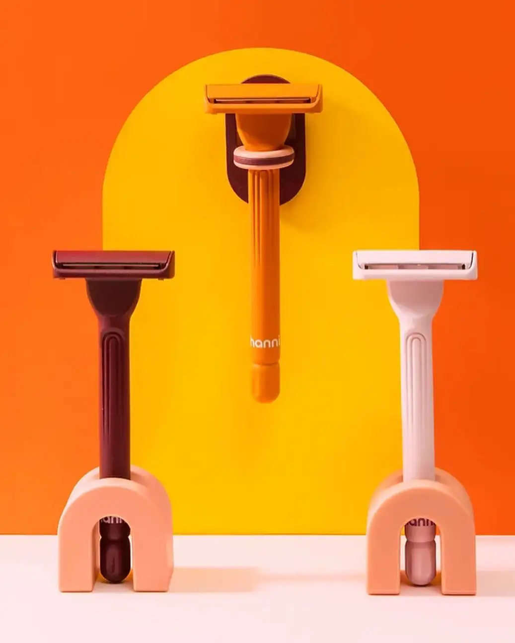
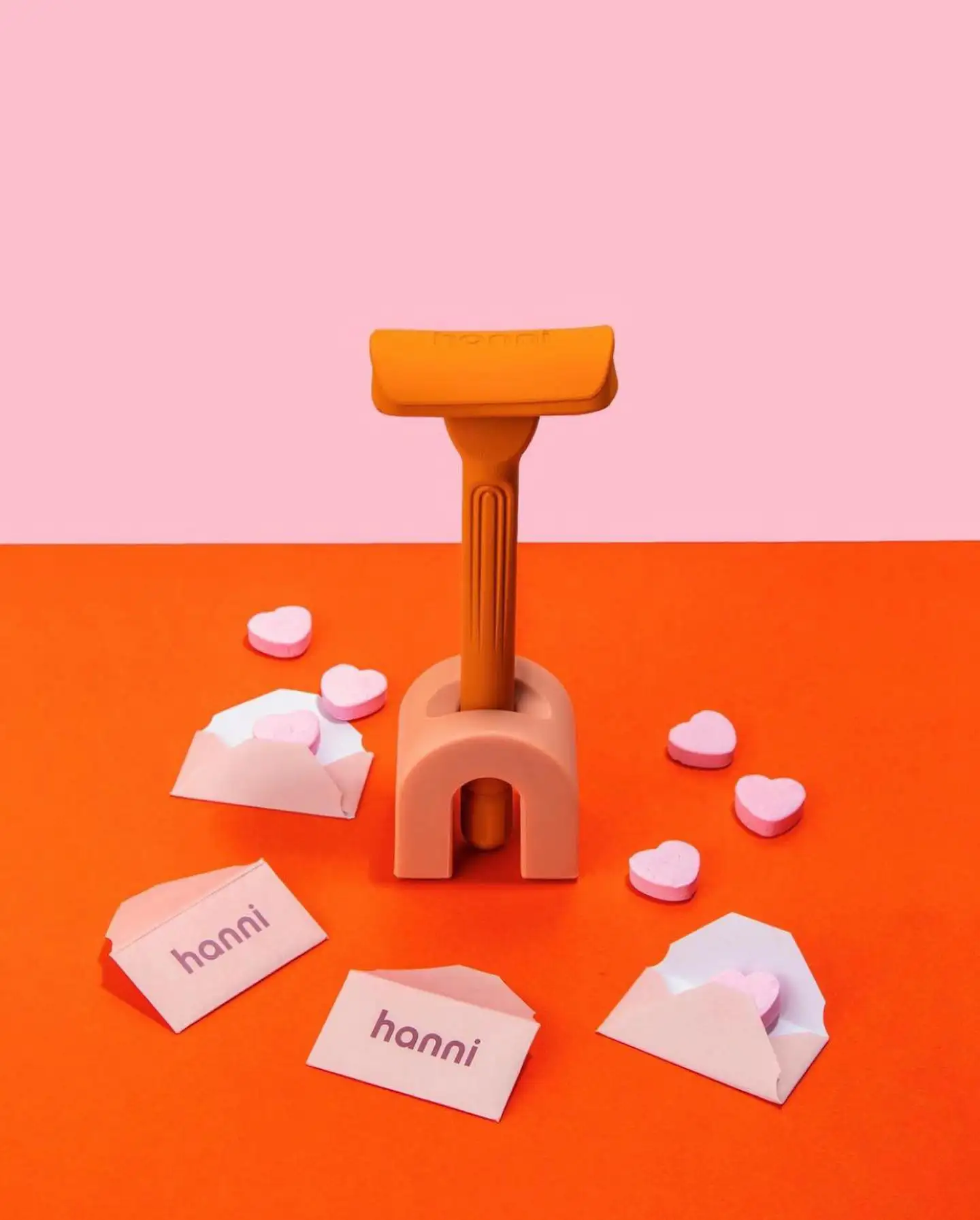
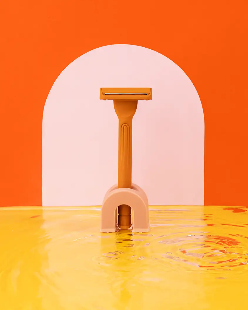
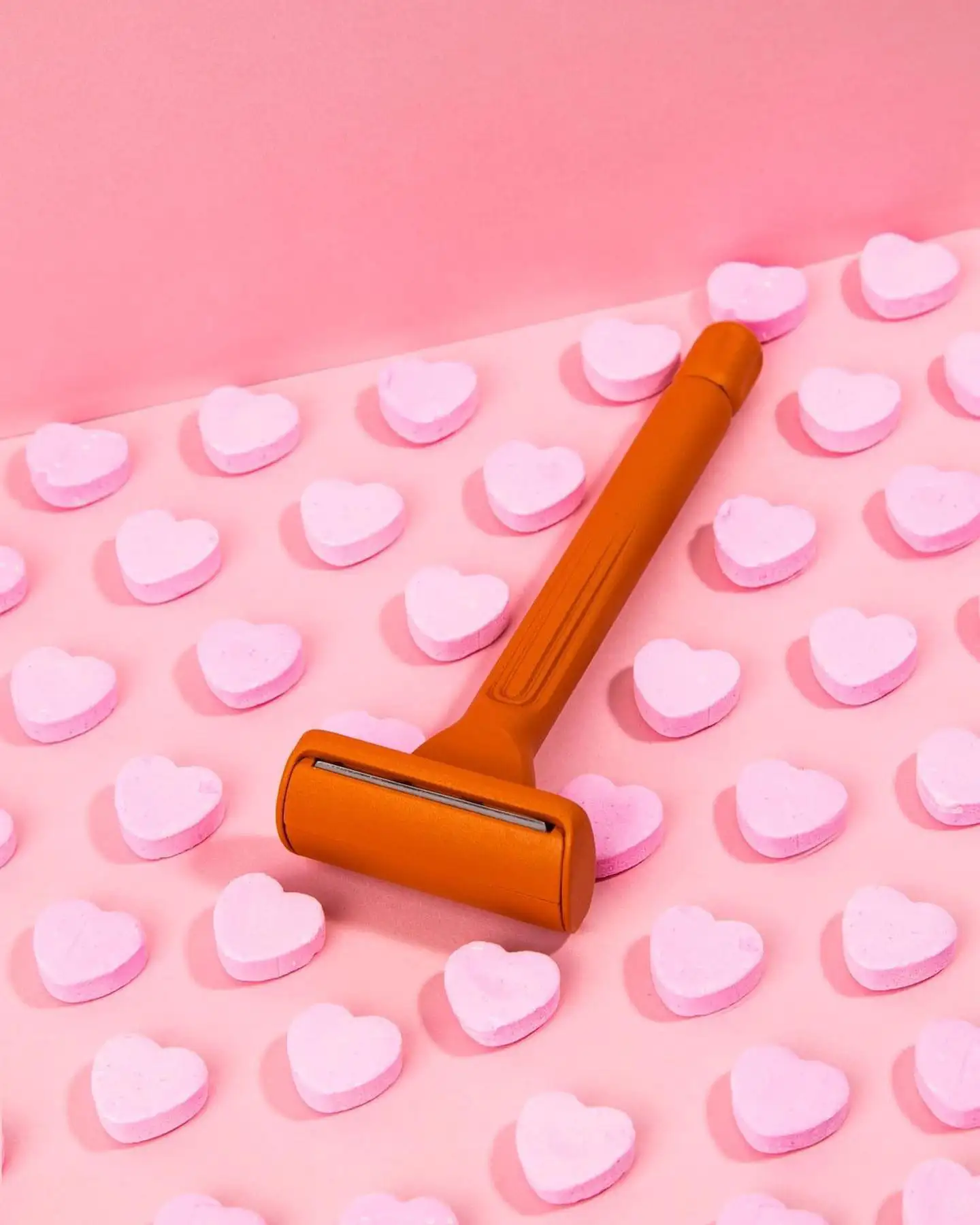
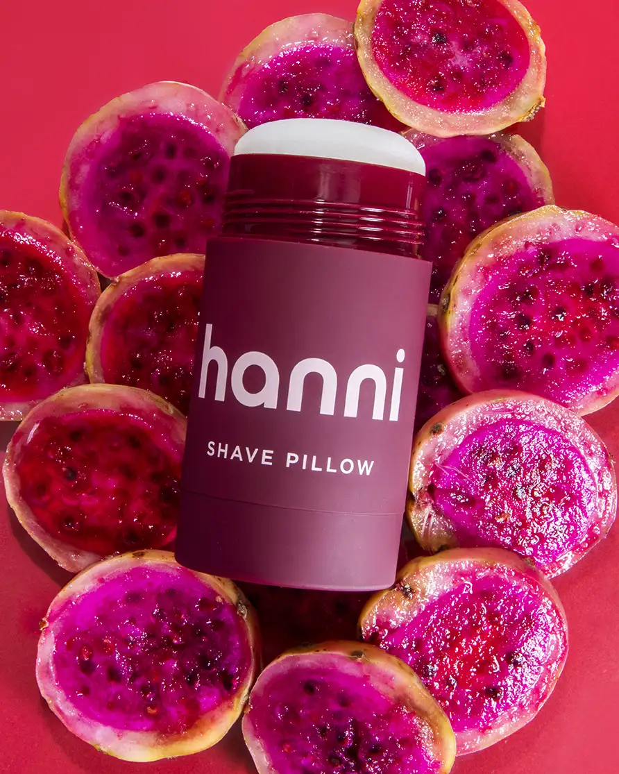
I've loved the look of bold and minimalist product photography for some time now, but in the past I haven't had clients who were interested in that style. Lately though I got lucky with 3 clients in a row who were wanting simple, clean, and minimal product photography. Fleurish lashes, Hanni razors, and Flo sinus relief. These brave brands gave me the opportunity to be courageous enough to be minimal, to embrace "less is more".
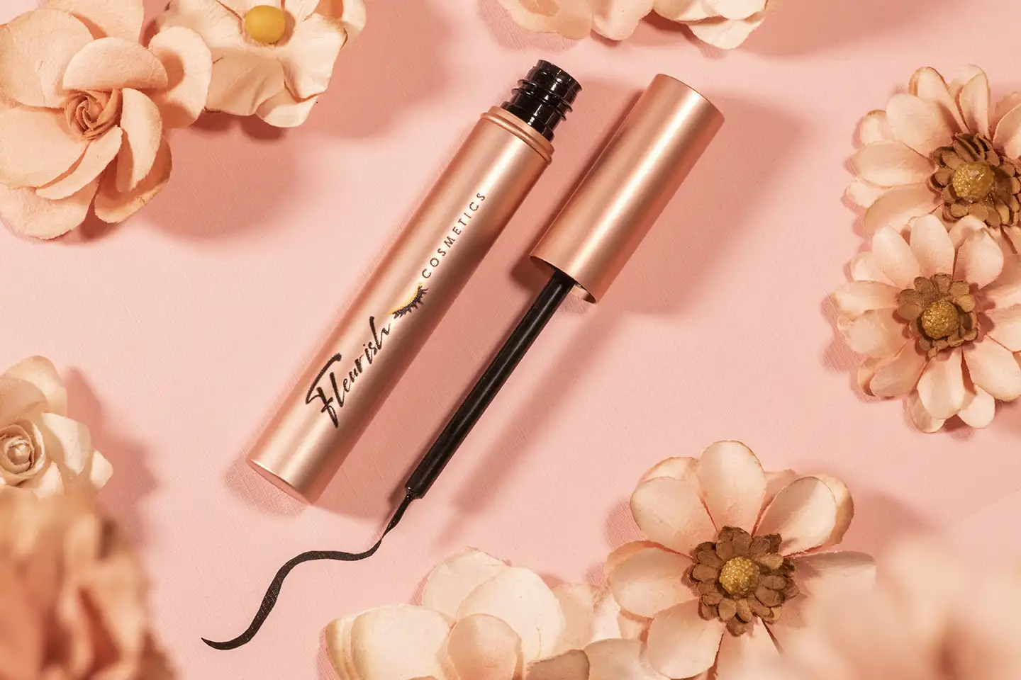
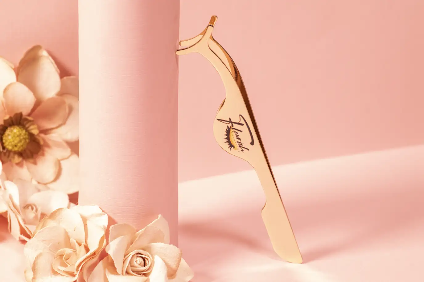
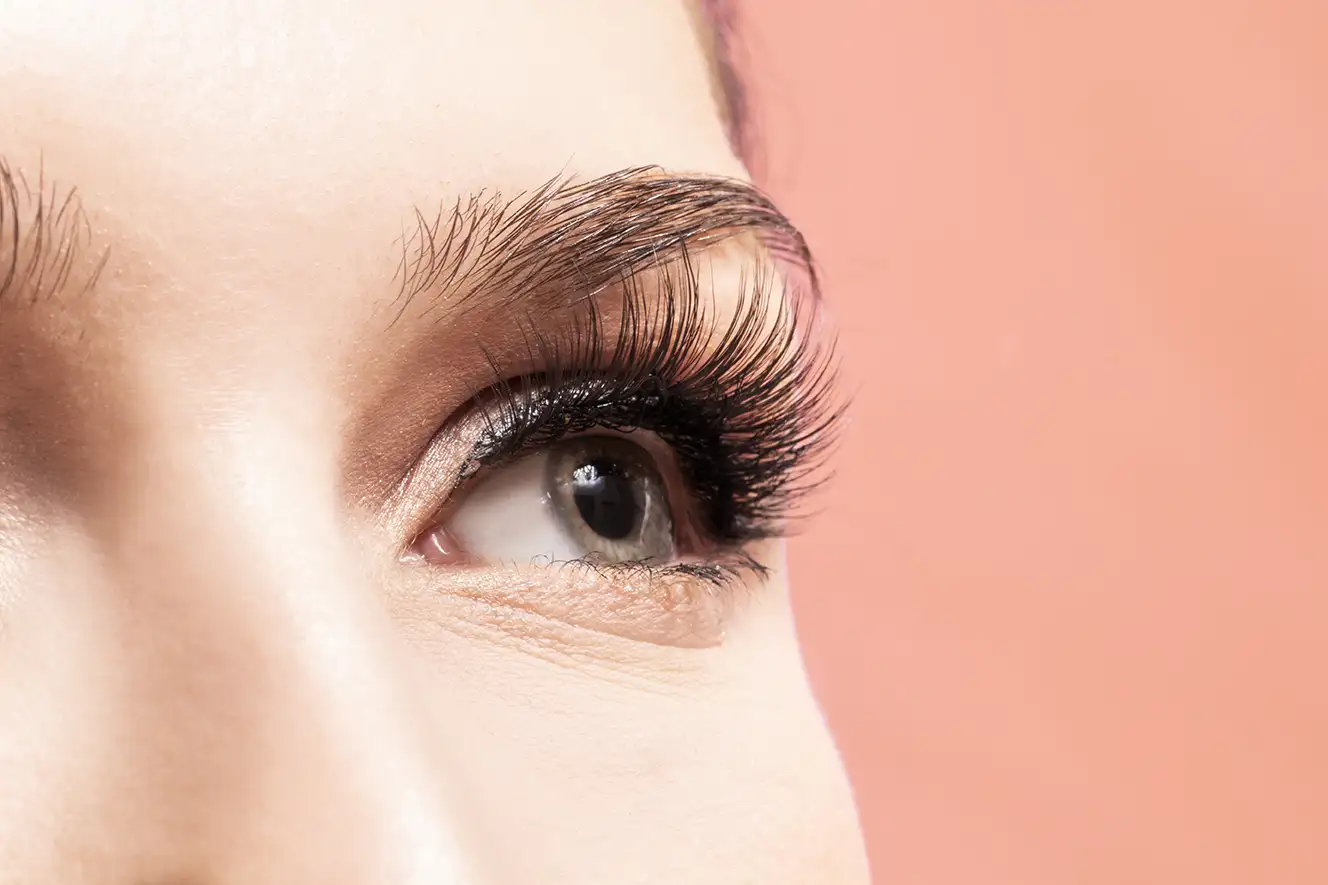
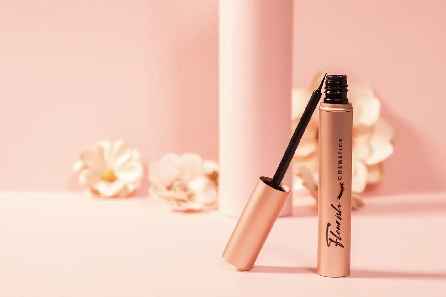
Each brand used minimalism in a different way. Fleurish wanted to use millennial pink in a nearly monochromatic scene that felt delicate. So I bought some paper in a millennial pink shade and stumbled across some paper flowers in that similar color genre. I focused on mimicking the curves of the lashes and the shapes of tubes. I kept the light simple and even to keep those colors flat and solid.
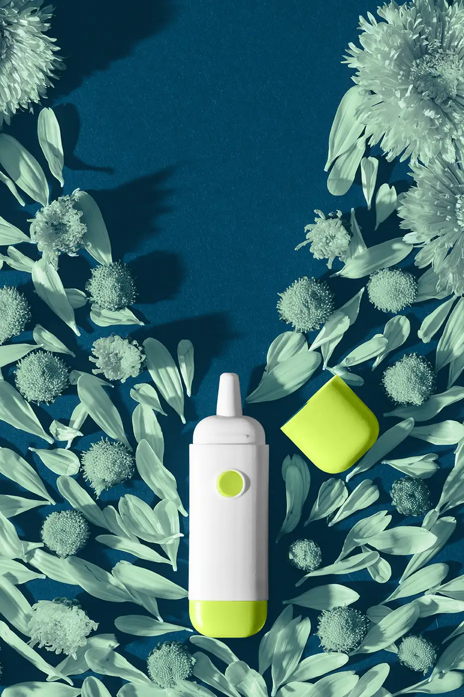
Flo didn't want any shadows to distract from the product and wanted to incorporate their very bright and bold brand colors. They wanted each scene to have a concept of their unit overpowering different allergens, but in a simple design that wasn't busy.
Hanni on the other hand loved the idea of not having many props, but instead using light to create shadow patterns in the scenes to add more atmosphere and detail. So we stuck with sheets of paper matching their warm brand colors and brought in light modifiers to create interesting patterns in the shadows.
So, as someone who normally lives in the world of "detail, Detail, MORE DETAIL!!!!" it's been fun to let loose, drop the props and fancy photoshop, and really hone in on composition, light, and color. I'm excited to see what genres my clients take me into next!






Comments